Brief
Dan defines the audience, metaphor, practical constraint, and what the work must make people feel.
Selected work · 2026
A process-led portfolio of original prompts, generated passes, hard corrections, collaborative exports, and human-finished design.
Read the case studies ↓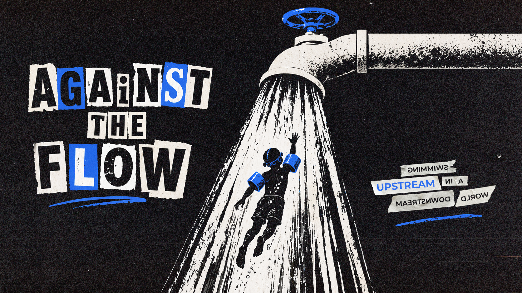
Selected work
01—06Four case studies follow the same honest sequence: original brief, first render, correction, collaborative export, final state, and the lesson worth carrying forward.
Case study 01
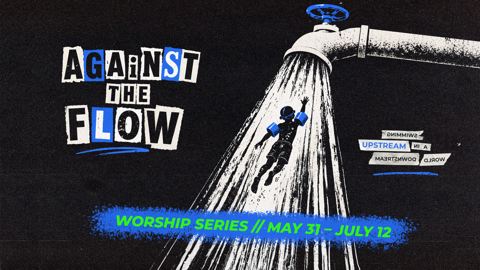
Final campaign systemThe original black-and-sludge campaign—before its later road-sign derivatives.
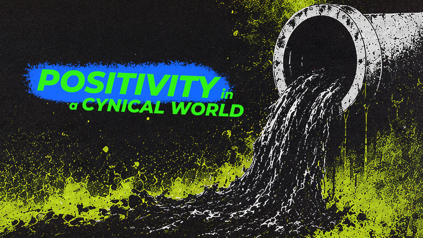
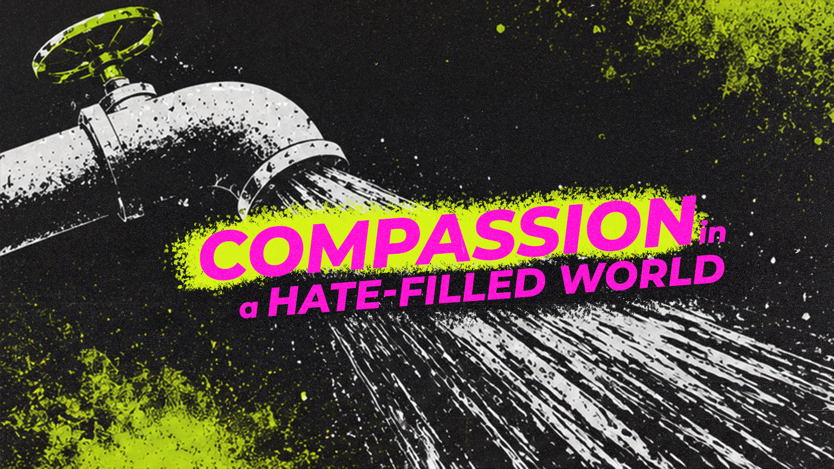
Culture’s barrage becomes sludge and pollution. The swimmies become the practical, almost childlike practices that help someone resist the current.
The tone needed to be gritty, aggressive, and culturally observant—not a clean water metaphor and not a generic “be different” graphic.
The earliest render itself was not recoverable. The critique was: maximal sludge detail, too little text-safe space, and a composition too busy to carry an entire campaign.
First-render file not found.
The feedback trail remains.
Dan’s corrections turned an atmospheric image into a usable design brief:
Case study reflection
The decisive correction was not cosmetic. Removing sludge made room for seven weeks of communication, while reversing the swimmer made the idea readable without explanation. The lesson: restraint and direction can carry more meaning than added detail.
Case study 02
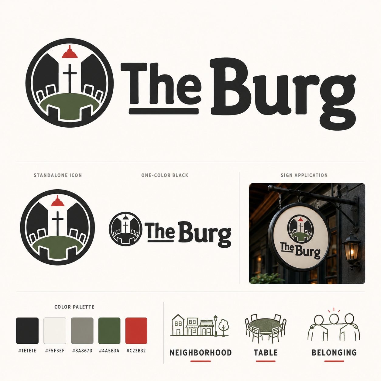
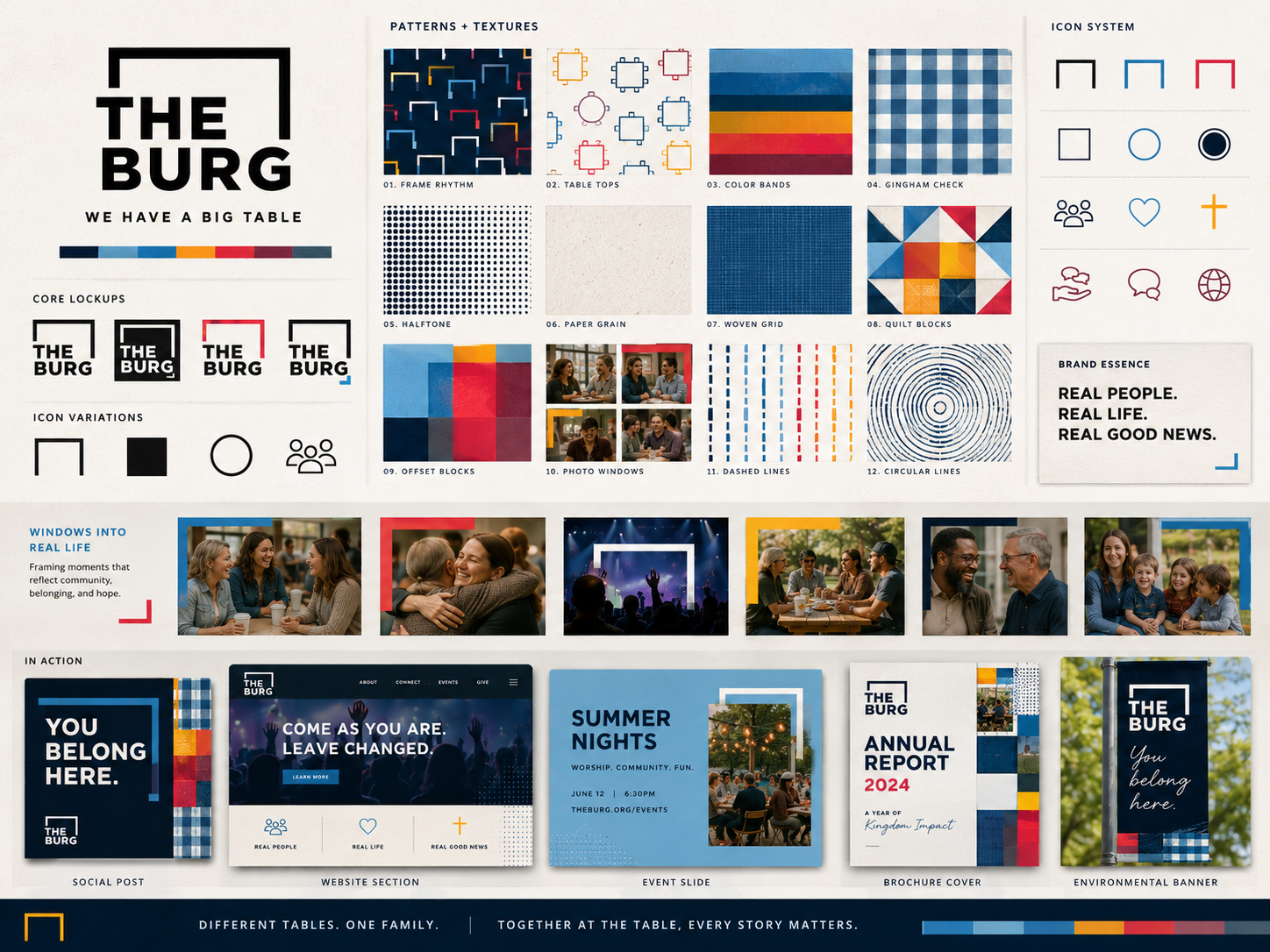
Identity in developmentA new church identity organized around neighborhood, belonging, and a seat at the table.
“The Burg” feels like a corner bar in an Irish neighborhood—the place you go to hang out. More intimate than a huge church. More community-driven than talent-driven. More shared responsibility than trusting the hired staff.
The assignment was a new concept and logo with some Ginghamsburg familiarity, but a distinct social promise: this is where people know one another.
Dan liked the green, the circular sign, and the table in the mark. The underline under “THE” felt oddly emphasized; the cross and hanging light together felt like too much; the type needed to stay in the Apex family.
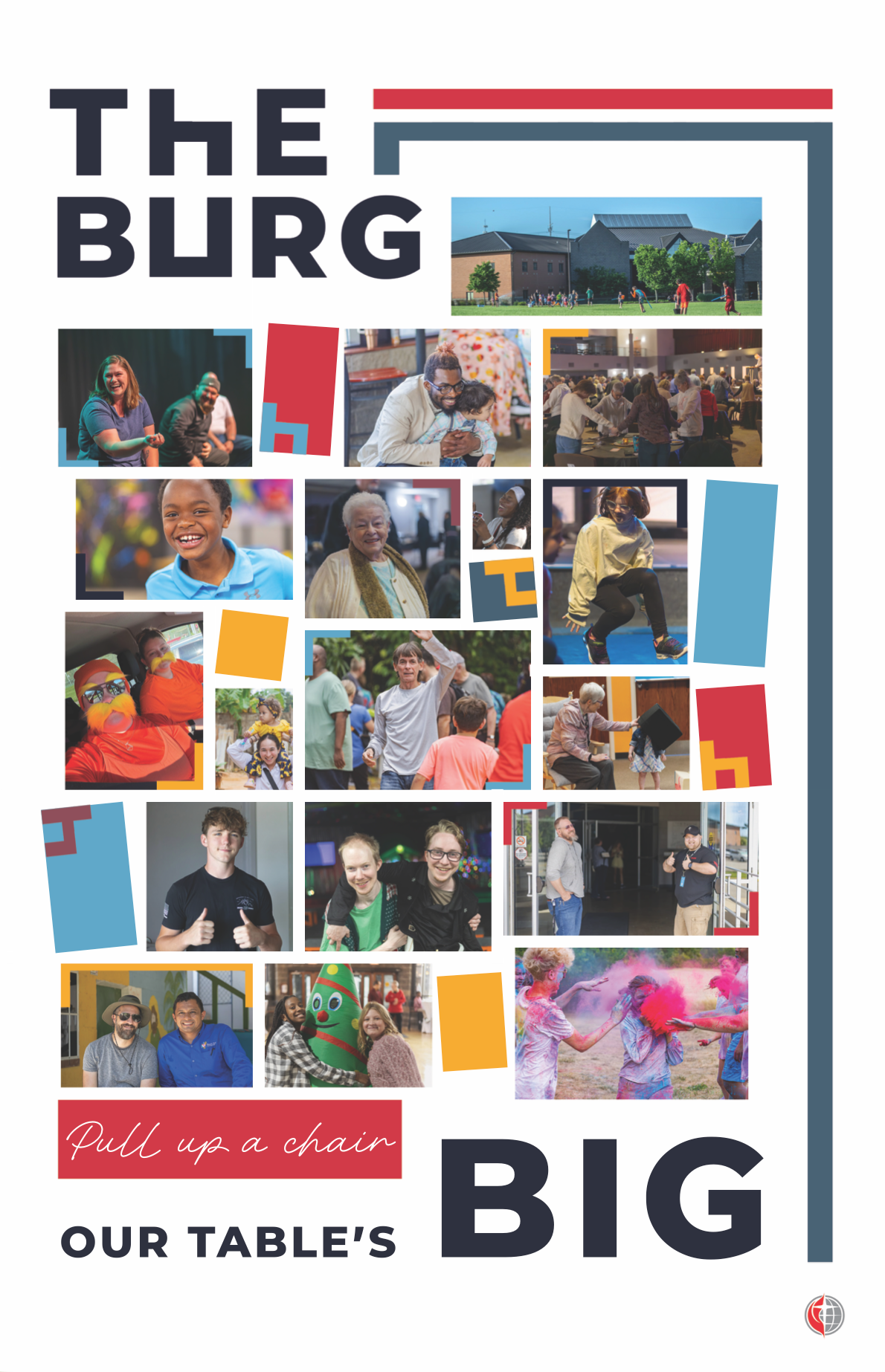
A later round sharpened the calibration: paint strokes and scribbles were rejected, pattern experiments were abandoned, and solids won. The table icon integrated with real photography became the promising center.
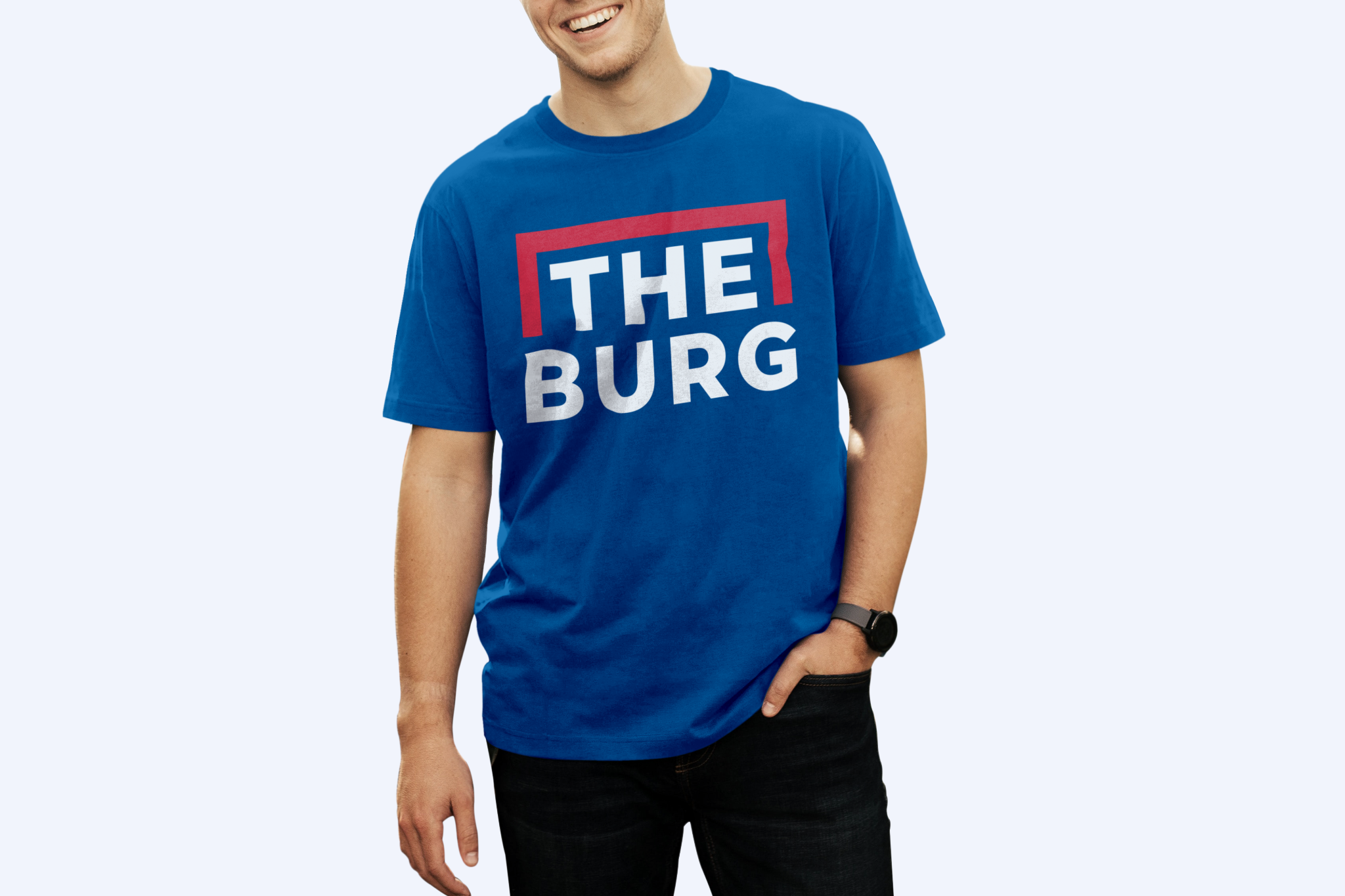
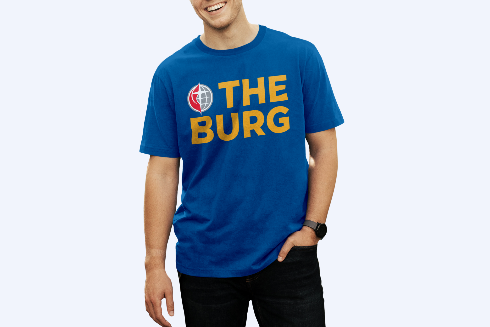
The poster was printed as an exploration, using real community photography and the plain invitation “Pull up a chair.” The shirts carry the most polished mark so far, but they have not been produced. None of these is being presented as a finished identity system.
Case study reflection
The strongest direction did not emerge from polishing the logo in isolation. It emerged when the table icon touched photography, signage, apparel, and plainspoken language. The lesson: prototype the identity in public-facing formats before declaring the system solved.
Case study 03
Final production exportsA shared launch date without forcing two age groups into one visual personality.
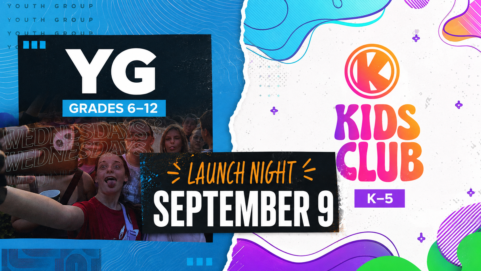
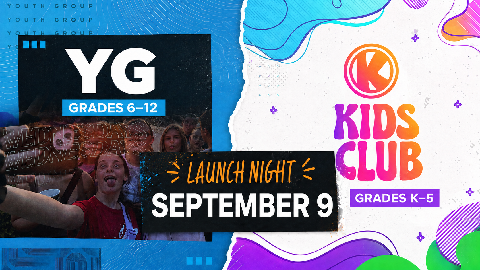
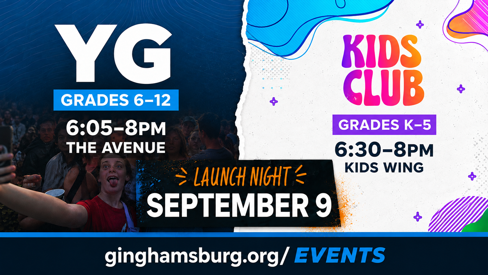
“This might be a little tricky… YG and Kids Club are starting on the same night… They each have a ‘look’ catered to their age groups. I need a promotional slide that promotes them both… either a blended approach… or a split-screen approach.”
The non-negotiables were September 9, the correct grade bands, and a 1920×1080 canvas.
Case study reflection
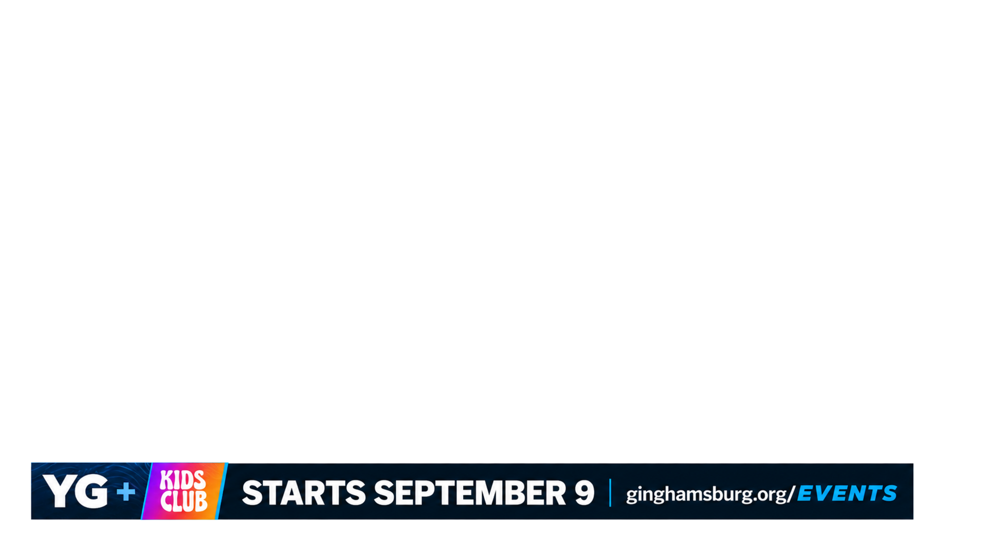
The system succeeds because it coordinates two identities without homogenizing them. The final lesson arrived through format: a great announcement can be loud, while a great lower third sometimes needs to nearly disappear. Dan’s acceptance was concise: “boom shacka lacka.”
Case study 04
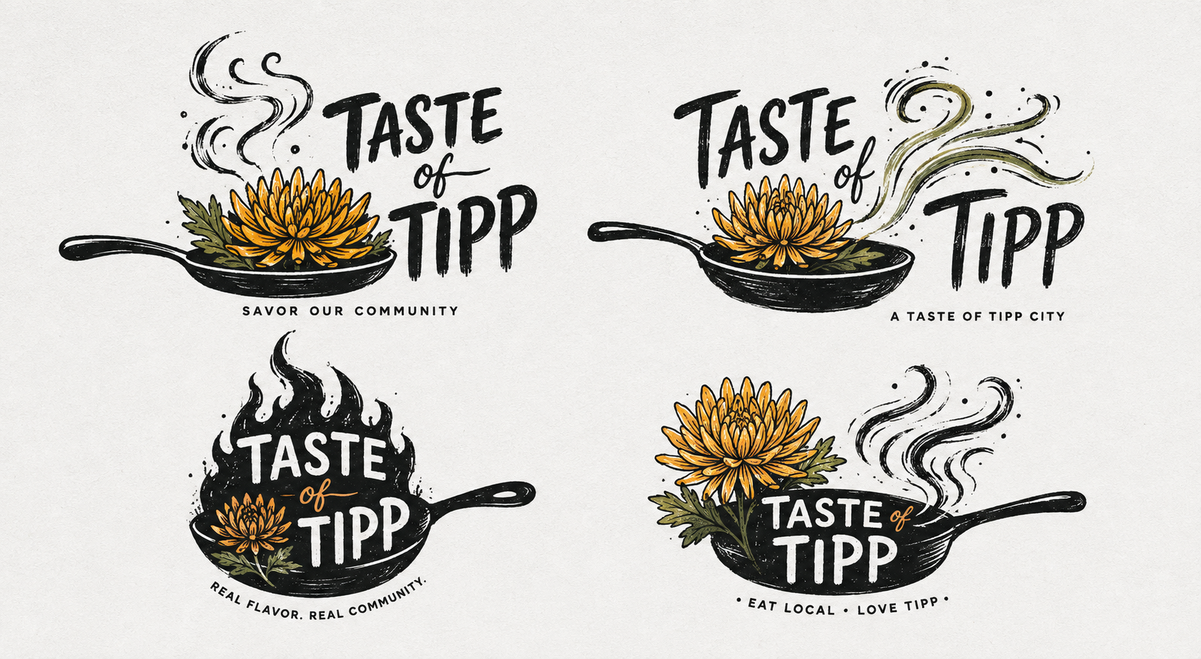
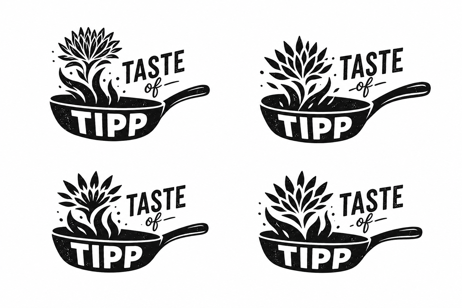
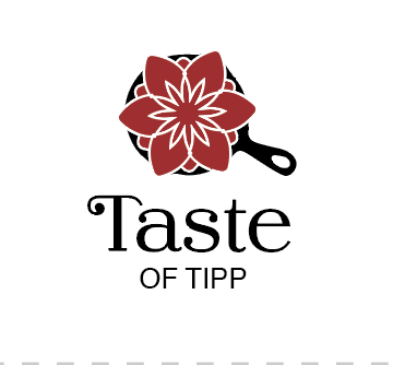
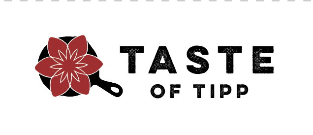
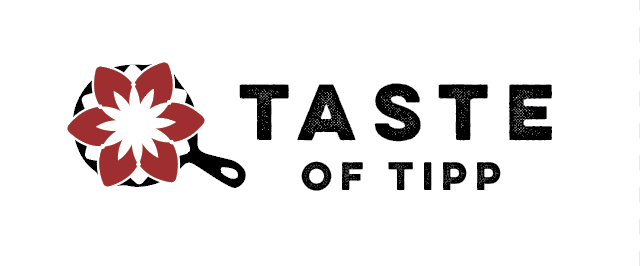
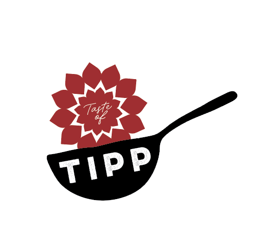
Concepts pushed · no final selectedNot simply food—the flavor, businesses, and personality that make a town feel like itself.
“Taste of a town” is its flavor, vibe, and culture. It is not exactly food—though food is part of it. It is the businesses that make up Tipp City.
The existing frying-pan cue and Tipp City’s famous mum offered obvious visual material, but combining them without shrinking the event’s meaning was the real assignment.
The critique moved in deliberate loops rather than a straight line:
Case study reflection
The process proved that the pan and mum can coexist, but it did not fully resolve whether the symbol represents civic character or food first. The lesson is not to mistake a polished option for a finished identity when the central strategic tension is still visible.
Supporting work
05An 8.5 × 11-inch, 300-dpi flyer blending school and fall-sports energy while protecting the center for final copy. The empty field is the feature.
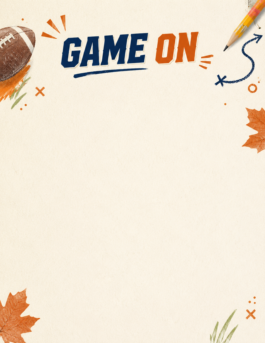
These welcome-card explorations document a recurring lesson: color can carry energy without filling every inch, and playful typography gets stronger when the eye has room to land.
“Homie. Negative space.”
The shortest creative brief in the portfolio—and one of the most useful.Working method
Human × machineDan defines the audience, felt need, concept, production constraint, and what must remain true.
ChatGPT turns the brief into visible directions quickly enough to compare, combine, or discard.
Dan corrects the model with specific visual judgment—hierarchy, symbolism, typography, restraint, and format.
The work is rebuilt, composited, typeset, adapted, and delivered for print, signage, screens, or apparel.
The case studies do not treat AI output as authorship by default. They show the exchange: where generation opened a door, where critique changed the work, and what actually reached production.